ShopDreamUp AI ArtDreamUp
Deviation Actions


Suggested Deviants


Suggested Collections


You Might Like…


Description
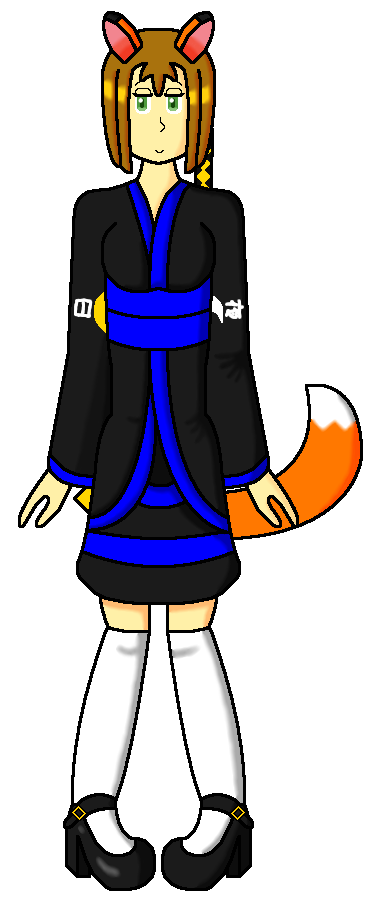
Remade version of this: 
Because I felt it was necessary to practice my skills.
Naomi Hanayama © Me
Because I felt it was necessary to practice my skills.
Naomi Hanayama © Me
Image size
375x900px 63.91 KB
© 2012 - 2024 DragonQuestWes
Comments10
Join the community to add your comment. Already a deviant? Log In
I hope the low ratings don't initially turn you off too much.
The biggest thing I see in this individual picture is a problem throughout your whole gallery; while arms and legs change position, of all your figures, at least the ones I've seen don't deviate from a full-front torso. Not only does this cause a lack in interest, it makes it impossible to improve very much. That's not to say your figures are horrible- the proportions are good, but drawing the same thing over and over shuts out progress before it has a chance to step in.
Rating "originality" and "vision" is kind of hard for me, because, after all, how could I know? you might have the most amazing, interesting ideas floating in your brain, but if you don't step outside of your comfort zone, they can not possibly be expressed to people looking at your work. I'm not familiar with your character, and this doesn't tell me much about her; is she sassy, shy, brave, outgoing? Her bent legs might say "cute and bubbly" but her eyes don't say much anything. You don't need to be familiar with a person to get an impression from them in a photograph, for instance, because we see it in body language. But expressing body language is impossible unless there is some life in the pose and face.
Compared to the old, I should point out, the old one has the better legs (erm, you know what I mean), because there is some definition in the ankles- here they sort of "blob out," at lack of better term.
The color in the skin isn't bad, but I would recommend using a less saturated blue, orange, and yellow everywhere else. With these particular tones and levels of saturation, they give off an effect of being unnatural. That's not to say super-saturated colors can't be used, but they need to have the shades and highlights to balance them out.
Anyway, I hope this review didn't scare you or come across as offensive There ARE good things about your work, but trying new things and doing A LOT of realism would be very beneficial.